2022.3.21|コーディング
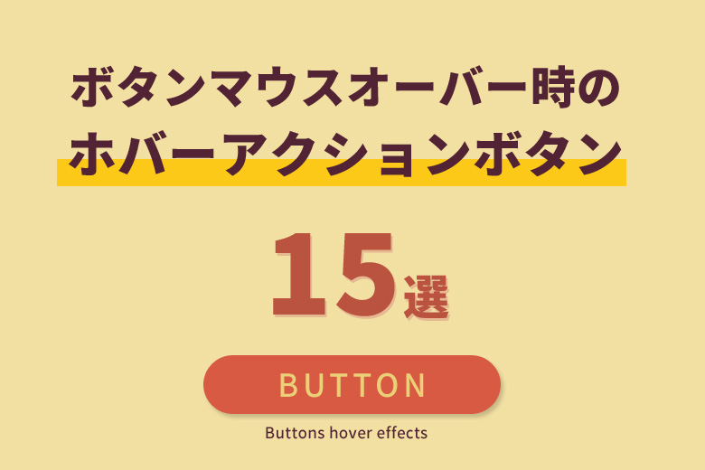
CSSでボタンマウスオーバー時に「ホバーアクション(ホバーエフェクト)」する方法
ナビゲーションやボタンは、必ずWebサイトに必要な要素です。従来のようにナビゲーションやボタンを画像で作成する方法もありますが、近年ではHTMLとCSSのみで作成する方がアクション要素を持たせることができることから増えています。
ナビゲーションやボタンに、「ホバーアクション」「ホバーエフェクト」を設定するには、HTMLとCSSのみで実装することができます。jQueryや画像などを使用せずにアニメーションを行うことが出来ます。
今回は、CSSでボタンマウスオーバー時に「ホバーアクション(ホバーエフェクト)」する方法を解説します。
本記事の内容
CSSでボタンマウスオーバー時に「ホバーアクション(ホバーエフェクト)」を実装する方法
CSSでボタンに「ホバーアクション(ホバーエフェクト)」を実装する場合は、「hover」や「transition」のプロパティを使用して配置します。 ボタンにマウスを置いたときに「ホバーアクション(ホバーエフェクト)」を実装させるためには、ボタンのCSSに「hover」プロパティを記述します。追加した「hover」プロパティにマウスを置いた後の変化する内容を記述します。
例
HTMLの記述
<a class="sample_button" href="#">ボタン</a>1.背景色をふわっと変化
マウスと置いたときに背景色がふわっと変化させるように「transition」プロパティを使ってアニメーションを実装します。
例
cssコード
※HTMLのボタンを「sample_button01」に変更します。
.sample_button01 {
  display: inline-block;
  width: 200px;
  text-align: center;
  text-decoration: none;
  line-height: 50px;
  outline: none;
  background-color: #333;
  -webkit-transition: all .3s;
  transition: all .3s;
}
.sample_button01:hover {
  background-color: #0061c3;
}
2.背景色を反転
マウスと置いたときに背景色を反転させるように「transition」プロパティを使ってアニメーションを実装し、背景色を白(#fff)に変更します。
例
cssコード
※HTMLのボタンを「sample_button02」に変更します。
.sample_button02 {
  display: inline-block;
  width: 200px;
  text-align: center;
  text-decoration: none;
  line-height: 50px;
  outline: none;
  background-color: #000;
  border:2px solid #000;
  -webkit-transition: all .3s;
  transition: all .3s;
}
.sample_button02:hover {
  color: #e02c74;
  border:2px solid #e02c74;
  background-color: #fff;
}
3.文字間を広げる
マウスと置いたときに文字間を広げるように「transition」プロパティを使ってアニメーションを実装し、「letter-spacing」を記述して文字間サイズを設定します。
例
cssコード
※HTMLのボタンを「sample_button03」に変更します。
.sample_button03 {
  display: inline-block;
  width: 200px;
  text-align: center;
  text-decoration: none;
  line-height: 50px;
  outline: none;
  background-color: #000;
  -webkit-transition: all .3s;
  transition: all .3s;
}
.sample_button03:hover {
  letter-spacing: 0.5em;
}
4.角丸に変化
マウスと置いたときに角丸に変化するように「transition」プロパティを使ってアニメーションを実装し、「border-radius」を記述して角丸サイズを設定します。
例
cssコード
※HTMLのボタンを「sample_button04」に変更します。
.sample_button04 {
  display: inline-block;
  width: 200px;
  text-align: center;
  text-decoration: none;
  line-height: 50px;
  outline: none;
  background-color: #000;
  -webkit-transition: all .3s;
  transition: all .3s;
}
.sample_button04:hover {
  border-radius: 10px;
}
5.浮き上がる
マウスと置いたときに浮き上がるように「transition」プロパティを使ってアニメーションを実装し、「transform」に「translateY」の値を記述して浮き上がる距離を設定します。
例
cssコード
※HTMLのボタンを「sample_button05」に変更します。
.sample_button05 {
  display: inline-block;
  width: 200px;
  text-align: center;
  text-decoration: none;
  line-height: 50px;
  outline: none;
  background-color: #000;
  -webkit-transition: all .3s;
  transition: all .3s;
}
.sample_button05:hover {
  transform: translateY(-5px);
}
6.拡大する
マウスと置いたときに拡大するように「transition」プロパティを使ってアニメーションを実装し、「transform」に「scale」の値を記述して拡大する幅を設定します。
例
cssコード
※HTMLのボタンを「sample_button06」に変更します。
.sample_button06 {
  display: inline-block;
  width: 200px;
  text-align: center;
  text-decoration: none;
  line-height: 50px;
  outline: none;
  background-color: #000;
  -webkit-transition: all .3s;
  transition: all .3s;
}
.sample_button06:hover {
  transform: scale(1.1, 1.1);
}
7.下に移動する
マウスと置いたときに下に移動するように「transition」プロパティを使ってアニメーションを実装し、「transform」に「scale」「translateY」の値を記述して下に移動する幅と距離を設定します。
例
cssコード
※HTMLのボタンを「sample_button07」に変更します。
.sample_button07 {
  display: inline-block;
  width: 200px;
  text-align: center;
  text-decoration: none;
  line-height: 50px;
  outline: none;
  background-color: #000;
  -webkit-transition: all .3s;
  transition: all .3s;
  box-shadow: 0 3px 5px rgb(0 0 0 / 50%);
}
.sample_button07:hover {
  box-shadow: none;
  transform: scale(0.99, 0.99) translateY(2px);
}
8.背景色が左右にわかれる
マウスと置いたときに背景色が左右にわかれるように「transition」プロパティを使ってアニメーションを実装し、「before」と「after」の要素を追加して装飾します。
例
cssコード
※HTMLのボタンを「sample_button08」に変更します。
.sample_button08 {
  display: inline-block;
  width: 200px;
  text-align: center;
  text-decoration: none;
  line-height: 50px;
  outline: none;
}
.sample_button08::before,
.sample_button08::after {
  position: absolute;
  z-index: -1;
  display: block;
  content: '';
}
.sample_button08,
.sample_button08::before,
.sample_button08::after {
  -webkit-box-sizing: border-box;
  -moz-box-sizing: border-box;
  box-sizing: border-box;
  -webkit-transition: all .3s;
  transition: all .3s;
}
.sample_button08 {
  position: relative;
  z-index: 2;
  background-color: #000;
  border: 2px solid #000;
  color: #fff;
  line-height: 50px;
}
.sample_button08:hover {
  background-color: #fff;
  border-color: #e02c74;
  color: #e02c74;
}
.sample_button08::before,
.sample_button08::after {
  top: 0;
  width: 50%;
  height: 100%;
  background-color: #000;
}
.sample_button08::before {
  right: 0;
}
.sample_button08::after {
  left: 0;
}
.sample_button08:hover::before,
.sample_button08:hover::after {
  width: 0;
  background-color: #e02c74;
}
9.背景色が上下にわかれる
マウスと置いたときに背景色が上下にわかれるように「transition」プロパティを使ってアニメーションを実装し、「before」と「after」の要素を追加して装飾します。
例
cssコード
※HTMLのボタンを「sample_button09」に変更します。
.sample_button09 {
  display: inline-block;
  width: 200px;
  text-align: center;
  text-decoration: none;
  line-height: 50px;
  outline: none;
}
.sample_button09::before,
.sample_button09::after {
  position: absolute;
  z-index: -1;
  display: block;
  content: '';
}
.sample_button09,
.sample_button09::before,
.sample_button09::after {
  -webkit-box-sizing: border-box;
  -moz-box-sizing: border-box;
  box-sizing: border-box;
  -webkit-transition: all .3s;
  transition: all .3s;
}
.sample_button09 {
  position: relative;
  z-index: 2;
  background-color: #000;
  border: 2px solid #000;
  color: #fff;
  line-height: 50px;
}
.sample_button09:hover {
  background-color: #fff;
  border-color: #e02c74;
  color: #e02c74;
}
.sample_button09::before,
.sample_button09::after {
  left: 0;
  width: 100%;
  height: 50%;
  background-color: #000;
}
.sample_button09::before {
  top: 0;
}
.sample_button09::after {
  bottom: 0;
}
.sample_button09:hover::before,
.sample_button09:hover::after {
  height: 0;
  background-color: #e02c74;
}
10.縦方向に回転
マウスと置いたときに縦方向に回転するように「transition-duration」プロパティを使ってアニメーションを実装し、「transform」に「rotateX」の値を記述して回転する角度を設定します。
例
cssコード
※HTMLのボタンを「sample_button10」に変更します。
.sample_button10 {
  display: inline-block;
  width: 200px;
  text-align: center;
  text-decoration: none;
  line-height: 50px;
  outline: none;
  background-color: #000;
  transition-duration: 1.5s;
}
.sample_button10:hover {
  transform: rotateX(360deg);
}
11.背景色が斜めに変わる
マウスと置いたときに背景色が斜めに変わるように「transition」プロパティを使ってアニメーションを実装し、「transform-origin」と「transform」のプロパティを記述して背景色の開始箇所等の設定します。
例
cssコード
※HTMLのボタンを「sample_button11」に変更します。
.sample_button11 {
  display: inline-block;
  width: 200px;
  text-align: center;
  text-decoration: none;
  line-height: 50px;
  outline: none;
  background-color: #000;
  position: relative;
  z-index: 1;
  overflow: hidden;
  transition: all 0.3s ease;
}
.sample_button11:hover::before {
  transform-origin: top right;
  transform: skewX(-45deg) translateX(0);
}
.sample_button11::before {
  content: '';
  width: 135%;
  height: 100%;
  background-color: purple;
  position: absolute;
  top: 0;
  left: 0;
  z-index: -1;
  transform-origin: top left;
  transform: skewX(-45deg) translateX(-100%);
  transition: inherit;
}
12.背景色が中央から円形に変わる
マウスと置いたときに背景色が中央から円形に変わるように「transition」プロパティを使ってアニメーションを実装し、「transform」に「scale」「translate」の値を記述して背景色の開始位置等の設定します。
例
cssコード
※HTMLのボタンを「sample_button12」に変更します。
.sample_button12 {
  display: inline-block;
  width: 200px;
  text-align: center;
  text-decoration: none;
  line-height: 50px;
  outline: none;
  background-color: #000;
  position: relative;
  z-index: 1;
  overflow: hidden;
  transition: all 0.3s ease;
}
.sample_button12:hover::before {
  transform: scale(1) translate(-50%,-50%);
}
.sample_button12::before {
  content: '';
  width: 120%;
  padding-top: 120%;
  border-radius: 100%;
  background-color:#e02c74;
  position: absolute;
  top: 50%;
  left: 50%;
  z-index: -1;
  transform-origin: top left;
  transform: scale(0) translate(-50%,-50%);
  transition: inherit;
}
13.背景色が斜めに回転
マウスと置いたときに背景色が斜めに回転するように「transition」プロパティを使ってアニメーションを実装し、「transform」に「scale」「translate」の値を記述して背景色の開始位置等の設定します。
例
cssコード
※HTMLのボタンを「sample_button13」に変更します。
.sample_button13 {
  display: inline-block;
  width: 200px;
  text-align: center;
  text-decoration: none;
  line-height: 50px;
  outline: none;
  background-color: #000;
  position: relative;
  z-index: 2;
  overflow: hidden;
  transition: all 0.3s ease;
}
.sample_button13::before,
.sample_button13::after {
  position: absolute;
  z-index: -1;
  display: block;
  content: '';
}
.sample_button13,
.sample_button13::before,
.sample_button13::after {
  -webkit-box-sizing: border-box;
  -moz-box-sizing: border-box;
  box-sizing: border-box;
  -webkit-transition: all .3s;
  transition: all .3s;
}
.sample_button13:hover::before {
  transform: scale(1) translate(-50%,-50%);
}
.sample_button13:hover::after {
  top: 0;
  left: 0;
  width: 100%;
  height: 100%;
}
.sample_button13:hover::after {
  -webkit-transform: scale(2) rotate(180deg);
  transform: scale(2) rotate(180deg);
  background: #e02c74;
}
14.ボーダーラインの色を中央からゆっくり変える
マウスと置いたときにボーダーラインの色を中央からゆっくり変えるように「transition」プロパティを使ってアニメーションを実装し、「transform」に「scale」の値を記述してボーダーラインの開始位置等の設定します。
例
cssコード
※HTMLのボタンを「sample_button14」に変更します。
.sample_button14 {
  position: relative;
  display: inline-block;
  width: 200px;
  text-align: center;
  text-decoration: none;
  line-height: 50px;
  border: 2px solid #e02c74;
  color: #e02c74;
  text-align: center;
  text-decoration: none;
  outline: none;
  transition: all .3s;
}
.sample_button14::before,
.sample_button14::after {
  position: absolute;
  top: -2px;
  right: -2px;
  bottom: -2px;
  left: -2px;
  z-index: 2;
  content: '';
  transition: all .3s;
}
.sample_button14::before {
  border-top: 2px solid #3be5ae;
  border-bottom: 2px solid #3be5ae;
  transform: scale(0, 1);
}
.sample_button14::after {
  border-right: 2px solid #3be5ae;
  border-left: 2px solid #3be5ae;
  transform: scale(1, 0);
}
.sample_button14:hover {
  color: #3be5ae;
}
.sample_button14:hover::after,
.sample_button14:hover::before {
  transform: scale(1);
}
15.ボーダーラインの色を左上からゆっくり変える
マウスと置いたときにボーダーラインの色を左上からゆっくり変えるように「transition」プロパティを使ってアニメーションを実装し、「transition」に値を記述してボーダーラインの開始位置等の設定します。
例
cssコード
※HTMLのボタンを「sample_button15」に変更します。
.sample_button15 {
  position: relative;
  display: inline-block;
  width: 200px;
  text-align: center;
  text-decoration: none;
  line-height: 50px;
  border: 2px solid #e02c74;
  color: #e02c74;
  text-align: center;
  text-decoration: none;
  outline: none;
  transition: all .2s;
}
.sample_button15::before,
.sample_button15::after {
  position: absolute;
  top: -2px;
  left: -2px;
  z-index: 2;
  content: '';
  width: 0;
  height: 0;
  border: 2px solid transparent;
}
.sample_button15:hover {
  color: #3be5ae;
}
.sample_button15:hover::before,
.sample_button15:hover::after {
  width: 100%;
  height: 100%;
}
.sample_button15:hover::before {
  border-top-color: #3be5ae;
  border-right-color: #3be5ae;
  transition: width .3s, height .3s .3s;
}
.sample_button15:hover::after {
  border-bottom-color: #3be5ae;
  border-left-color: #3be5ae;
  transition: height .3s, width .3s .3s;
}
まとめ
CSSでボタンなどにエフェクトやアニメーションを設定する方法が沢山あります。
今回のようにCSSだけでボタンマウスオーバー時に「ホバーアクション(ホバーエフェクト)」など動きを付けることが出来るので画像でボタンを作成する手間も無くなりますしJavascriptで設定する必要もなくなりますね。
色んなボタンの作成方法を覚えておくと良いですね。